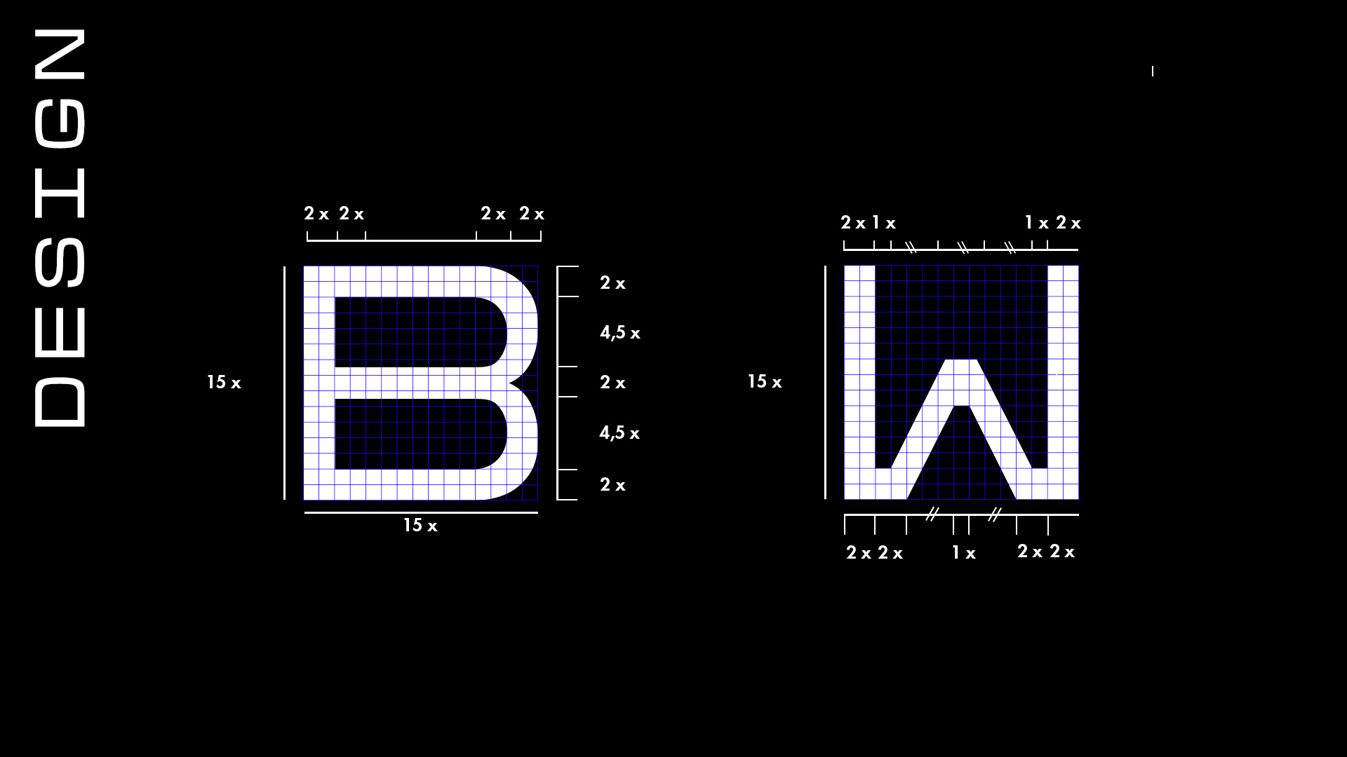
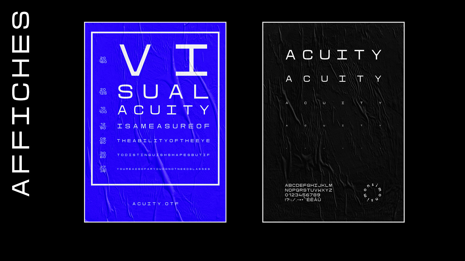
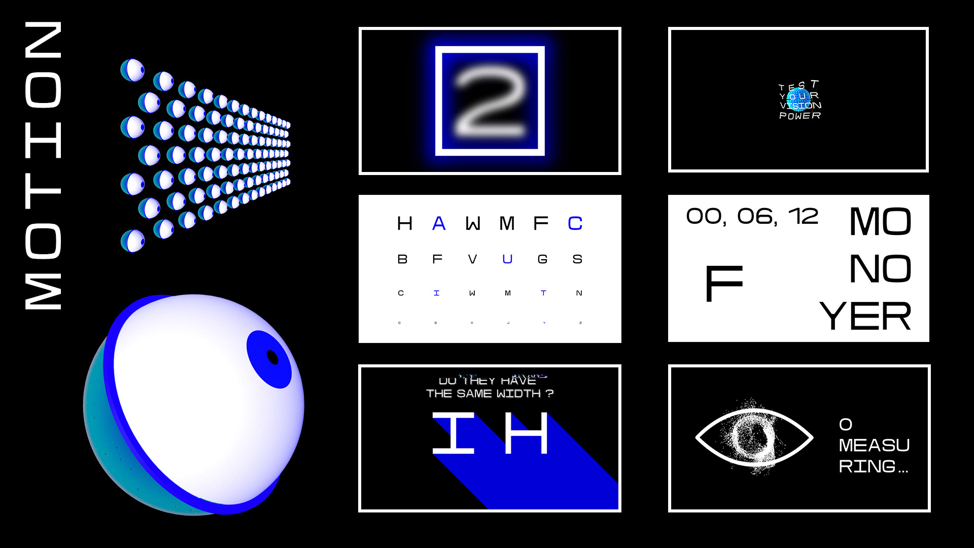
This project was realized as part of a typography workshop with Gonzalo Garcia Barcha. A challenge: to create the first typography for ophthalmology. An optotype is a character / form for measuring visual acuity. My goal is that all typography be different optotypes to create the first "opto-typograpgraphy" to test the power of vision. So I did for each character function grid of 15 squares out of 15. According to this process, Acuity has the particularity that all the characters will touch the 4 edges of the square and fill by frame of two squares in thickness to be uniform mathematically. This will create characters that are misshapen to the eye but geometrically equivalent. Subsequently, I realized a video to make feel the universe of the typography, its scientific report and sometimes his disturbing side of the test of the vision. This project allowed me to improve the creation of a typography working hand by hand with the brilliant typographer Gonzalo Garcia Barcha.